StackAdapt Internship | Summer 2026
Scaling collaboration for marketing teams
through internal sharing tools.
INTRO
StackAdapt is a self-serve advertising platform that lets marketers run programmatic ad campaigns across native, display, video, and connected TV. Orchestration Flows is one of its newer core tools where our Account Managers (AMs) and clients build multi-step automated marketing journeys directly on the platform.
My role was to convert this newer feature from something only visible inside the platform into something shareable to promote adoption and user retention.
ROLE
Product Designer
TEAM
Product Manager
Software Engineer
UXR Manager
TYPE
Platform Design
Feature Ideation
UX Research
TOOLS




Problem
Orchestration Flows had no way to leave the platform.
Sharing a flow meant screenshots, retyping, and a full call to explain.
Users built their own export just to work around it.
Solution
Designed the flow's live components as standalone, exportable steps.
Built a customizable PDF export, so people control what gets included.
Outcomes
Prototype tested well enough that users described it as clicking through the real platform.
Validated a real gap AMs were already working around on their own through in-depth testing.
Process
SETTING THE SCENE
External sharing was practically non-existent.
An Orchestration Flow is an automated marketing journey, often the entire strategy behind a campaign and built out as a branching diagram, for example: if a user does this, send them here; if they don't respond, wait, then try something else; if they convert, stop.
For an Account Manager, the flow itself is the pitch. It's the thing they walk a client through to justify a strategy and get sign-off before a single ad goes live.
By nature, these flows have immense amounts of information that are stored in each step. Below are some examples of a flow and what is stored in a single step card.


An example of how much information is within a single step in a flow.
PAIN POINTS
Users began finding negative loop holes.
The only way to share an Orchestration Flow was to sit on a call and share your screen or take 10+ screenshots: one for the whole canvas and one for every side panel clicked into.
Users would retype the details underneath each image because a screenshot alone doesn't explain what a trigger or condition actually does.
One AM even used Claude to build their own HTML export and started sending it to clients, until it needed a disclaimer that it wasn't an official StackAdapt product.


An actual email sent from an Account Manager.
An AI-built HTML replica of an Orchestration Flow.
Research
COMPETITIVE ANALYSIS
Validating a gap worth filling.
I wanted to know if this problem had already been solved somewhere else. I looked at competitors with a similar flow or journey builder and expected to find at least a few different approaches to sharing outside the platform. Turns out, none of them had one.

KLAYVIO
Offers an export but only the underlying segment/flow data, not the visualization itself. A client receiving it would not see actual branching logic.

HUBSPOT
Lets users export a flow as a static PNG image. Users on HubSpot's own community forum have been asking for a full PDF export for years.

BRAZE
Users have publicly asked for a way to print or export a campaign flow map. The workaround is to manually recreate the flow in Visio or Lucidchart.
WORKFLOW
Using AI as an exploration tool.
Once I finalized the flow and every new component in Figma, a lot of my iteration happened in VS Code with Claude's extension unless there was concept refinement needed.
I pulled straight from the StackAdapt codebase and built in a prototype branch. This helped in testing because it was built off product, the prototype wasn't just a visual approximation.
Below is a diagram of my AI process that I shared with my design team for AI enablement.

TESTING GOALS
How can we use this opportunity to promote adoption and solidify user retention?
Once a prototype existed, I created a discussion guide to explore three main areas:
Could users find and use Export without help?
What information did clients actually need to see, at a glance and in detail?
And would users trust the result enough to send it to a client?
I conducted 6 separate hour-long testing sessions with guidance from my Senior UX Researcher, targeting internal Account Managers and external agency clients.
RESEARCH FINDINGS
The concept was validated, but the content wasn't.
Nobody in testing needed the concept explained to them and each user understood why an exportable flow should exist the moment they saw it. When it came to trusting what actually came out of it, that's where things fell apart.
AMs need specifics, not summaries.
"[trigger/step] selected" told people nothing on its own.
AMs expect that export doubles as a form of QA for the flow.
Most participants asked for the actual campaign names and conversion events.
The export needs an argument, not just data.
It was ordered like a data model: metadata, diagram, steps, stats.
It never explained why the flow existed in the first place.
AMs still had to write that explanation separately, in the email around it.
Layout can't get in the way of user trust.
The cover page was the single most-flagged complaint, called out unprompted as looking unfinished.
People wanted to scroll, not flip. Pageless got more votes across testing, nobody asked for pagination back.
Solution
DESIGN DECISION #1
Online vs. Offline visualizations.
Almost every decision in this project came back to the same question: how do you take something interactive and make it static without losing information or context?
A live step is built to be clicked, side panels hold the details. I explored new step components designed specifically for export: either for enhanced flows with extra details. The challenge was using user insights to strategically fit live information into an exported design.
I did this for 12 steps (4 starting points, 4 actions, 4 rules) resulting in 24 changes.


Live
Exported


Live
Exported
DESIGN DECISION #2
Giving users control instead of guessing for them.
Users couldn't have a one-size-fits-all document since they shared flows under different pre-tenses. This led to designing customizability of what information is actually included in their document, before its creation and with the ability to edit it after.
Decision fatigue was the main concern during concept ideation. I whiteboarded a way to group everything into a set of specific categories against edge cases that appeared in testing to make sure it matched how people really wanted to use an export.
DESIGN DECISION #3
Paginated export vs. pageless scrolling.
My first few concept iterations modelled like a document meant to be printed or organized by page number since I assumed that's closest to how a pitch deck usually gets used.
To test it fairly, I split participants into two groups, one saw the pageless version first and the other saw paginated first, so early exposure wouldn't bias which one users preferred. Pageless held up as a real use case matching how people actually thought about a flow.
Beyond Design
DESIGN ENGINEERING
Designers don't need to wait anymore.
Small UI and bug fixes used to sit in a backlog for weeks while waiting on engineering that had better things to prioritize. With AI-assisted tooling in VS Code (Cursor and Claude Code, wired up through MCP), I pushed PRs myself with quick code reviews from devs.
New Card Components
Integrations Page Connector
Reflection
TAKEAWAYS
Assumptions will always be assumptions.
I still believe it's a strong design skill to empathize with your user and assume with best judgment, especially with limited resources. But that only holds if you go back and check the assumption once real data exists.
Design can stop waiting on the usual bottlenecks.
We're in an age in tech where designers are a lot more capable than before, not because the responsibilities changed, but because the tools around us did. Putting a living in-platform prototype in front of users got us to the right answers faster.
Data without a point of view is a liability.
I initially treated the export as a simple data transfer, but quickly realized it was more than that. Exposing raw complexity to a client doesn't build trust; it creates confusion.
A successful export curates the noise so the user's expertise can speak for itself.
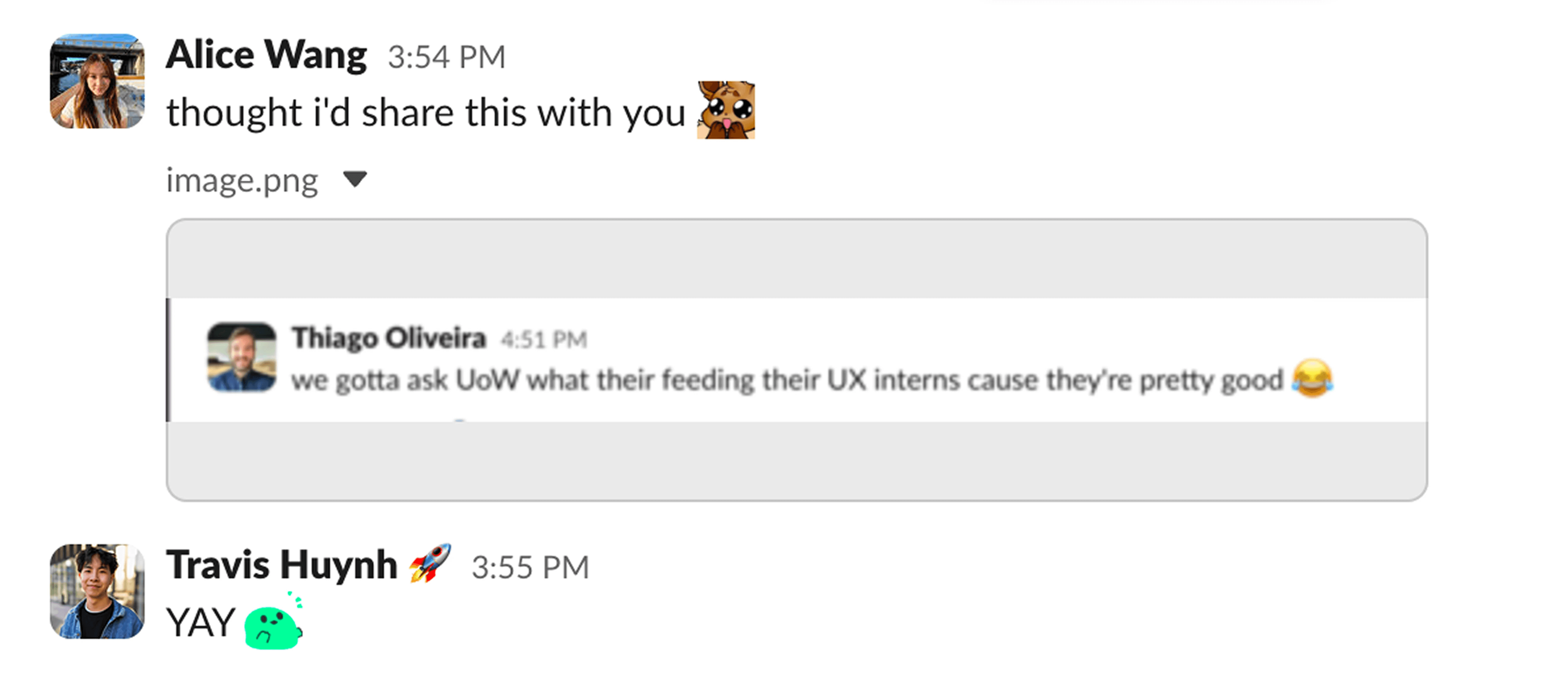
a win from my director !! :)


